What is glassmorphism?
Glassmorphism is a modern UI design trend that uses translucent surfaces and background blur to create depth, focus, and a frosted-glass aesthetic. In this tutorial, you’ll learn how to create frosted-glass cards using CSS backdrop-filter, subtle shadows, and border glints.
HTML structure
Here’s a simple card you can apply the effect to:
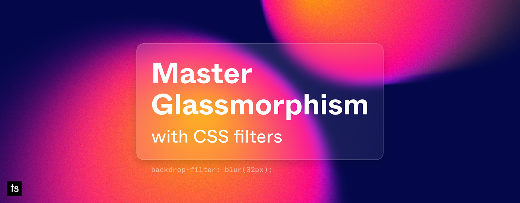
<div class="glassmorphism padding-md radius-lg">

  <div class="text-xl text-bold margin-bottom-2xs">
    Master <br> Glassmorphism
  </div>

  <div class="text-lg">
    with CSS filters
  </div>

</div>
I’m using my own helper classes (
padding-xl,radius-lg,text-2xl, etc.) for spacing and typography. Adjust them to match your setup, or use your preferred CSS framework.
Background (optional, but recommended)
Glassmorphism looks best when there’s some content behind the card to blur. A background image, gradient, or pattern makes the effect more visible.
.code-demo__body {
  background-color: #04084a;
  background-image: url("/assets/images/demo/img-glassmorphism-demo.png");
  background-position: center;
  background-repeat: no-repeat;
  background-size: auto;
  padding: 64px;
}
The key takeaway: the
.glassmorphismstyles create the effect; the background just enhances it.
CSS for Glassmorphism
Apply these styles to create the frosted-glass effect:
.glassmorphism {
  background: rgba(255, 255, 255, .2);
  box-shadow: 0 8px 32px rgba(0, 0, 0, .2);
  backdrop-filter: blur(32px);
  color: #fff;
  position: relative;
  text-align: left;
  -webkit-backdrop-filter: blur(32px);
}
How it works
rgba(255,255,255,0.2)creates a semi-transparent backgroundbox-shadowadd subtle depthbackdrop-filter: blur(32px)blurs the content behind the card
Adding a border glint
We can enhance the card with a reflective border effect using a pseudo-element (::before).
The pseudo-element (::before)
.glassmorphism::before {
  content: "";
  position: absolute;
  inset: 0;
  border-radius: inherit;
  padding: 2px;
  background: linear-gradient(
    45deg,
    rgba(255,255,255,0) 30%,
    rgba(255,255,255,0.8) 50%,
    rgba(255,255,255,0) 70%
  );
  background-size: 200% 100%;
  animation: glint 5s linear infinite;
  -webkit-mask: linear-gradient(#fff 0 0) content-box, linear-gradient(#fff 0 0);
  -webkit-mask-composite: xor;
  mask-composite: exclude;
}
How it works
::beforecreates an extra layer without changing HTMLposition: absolute+inset: 0makes it cover the card fullyborder-radius: inheritensures the glint matches card cornerspadding: 2pxdefines a narrow border area for the effectlinear-gradientcreates a diagonal reflective streakbackground-size: 200% 100%andanimationmoves the gradient continuouslymask-compositeensures the glint only appears on the edges, not over the content
Keyframes for glint animation
@keyframes glint {
  0% { background-position: 100% 0; }
  100% { background-position: -100% 0; }
}
This animates the glint smoothly from left to right in a continuous loop.
Optional pro tips
- Try different
backdrop-filter: blur()values for more or less frost - Adjust
rgba()opacity for stronger or subtler glass - Combine with gradients, images, or even video backgrounds for dynamic effects
See it in action
Check out the interactive demo below and watch the frosted-glass effect and animated glint come to life.