An improved User Experience in Mosaic for Servelec’s Social Care
- Client
- Servelec
- Industry
- Social Care
- Year
- 2019
Overview
Servelec asked me for some UX Consultancy for a new Mosaic release. Mosaic is a Digital Case Management System for Social Care and allows the management of adult’s, children and finance cases all on one platform.
When starting on the project, I found existing user research material that had been prepared by a UX Consultancy. This research was useful and insightful and gave me a good steer towards improving the service. However, it did not include visual design, so it was my role to design a new look and feel.
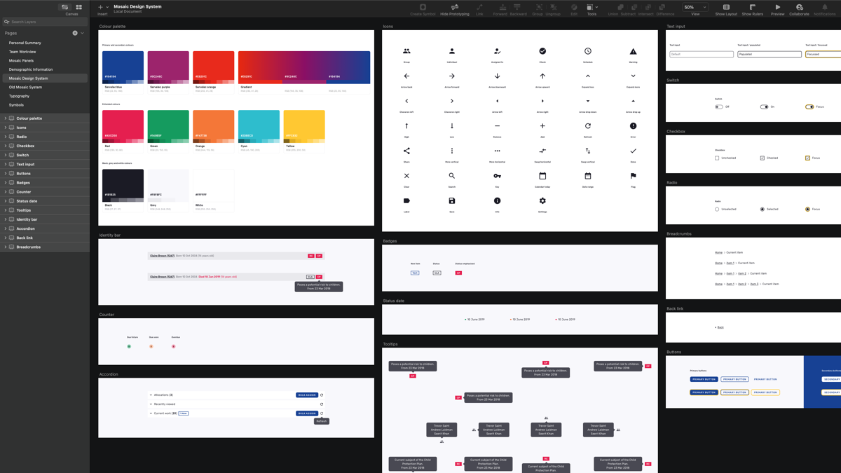
A design system built from scratch
After research and investigation of the existing system were complete, I was then able to focus my attention on the visual look and feel for the entire system.
I built a design system that contained a collection of reusable elements. They consisted of colour palettes, iconography, badges, accordions, buttons, counters, form elements and more.
Each element was carefully designed to ensure accessibility and standards were baked in from the start. These elements were the building blocks for page design, ready to be handed over for development.
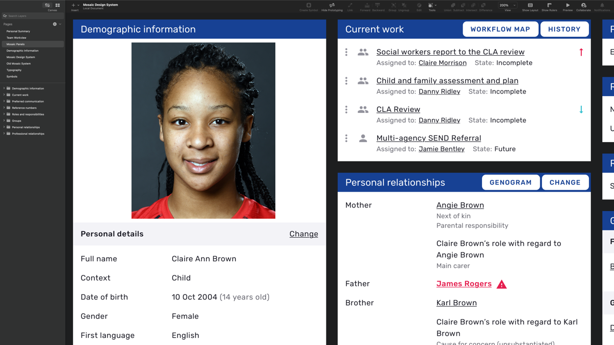
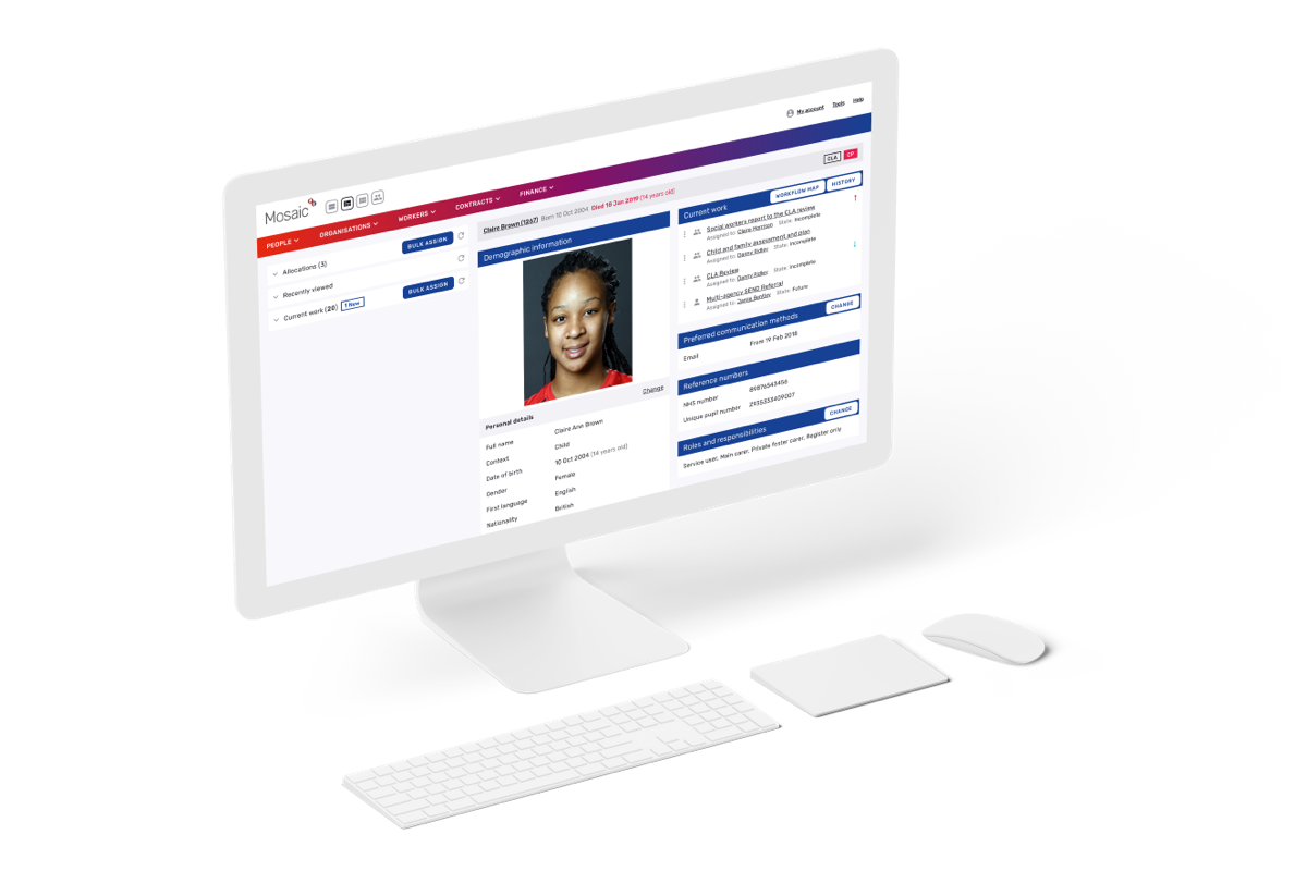
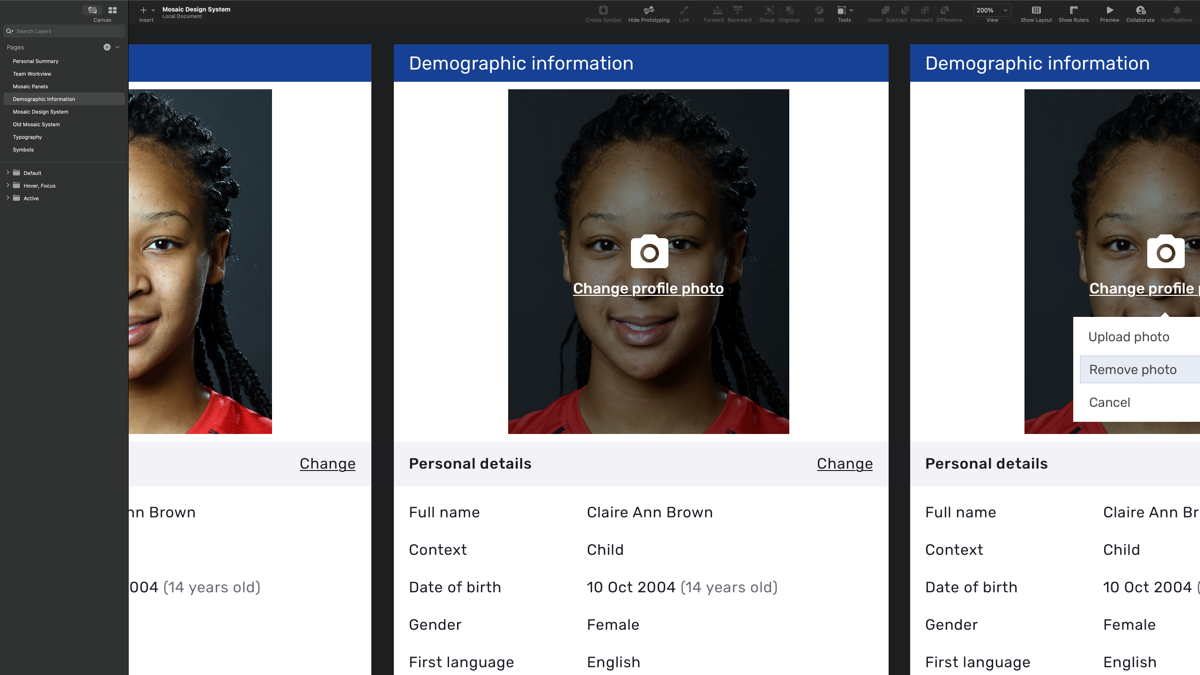
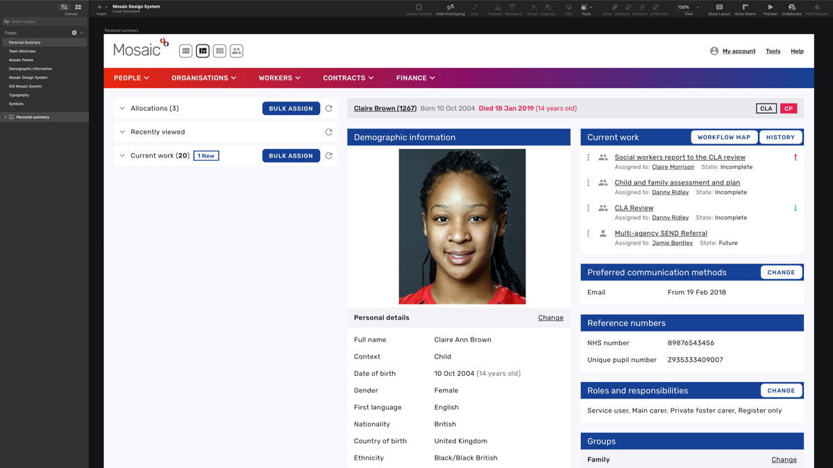
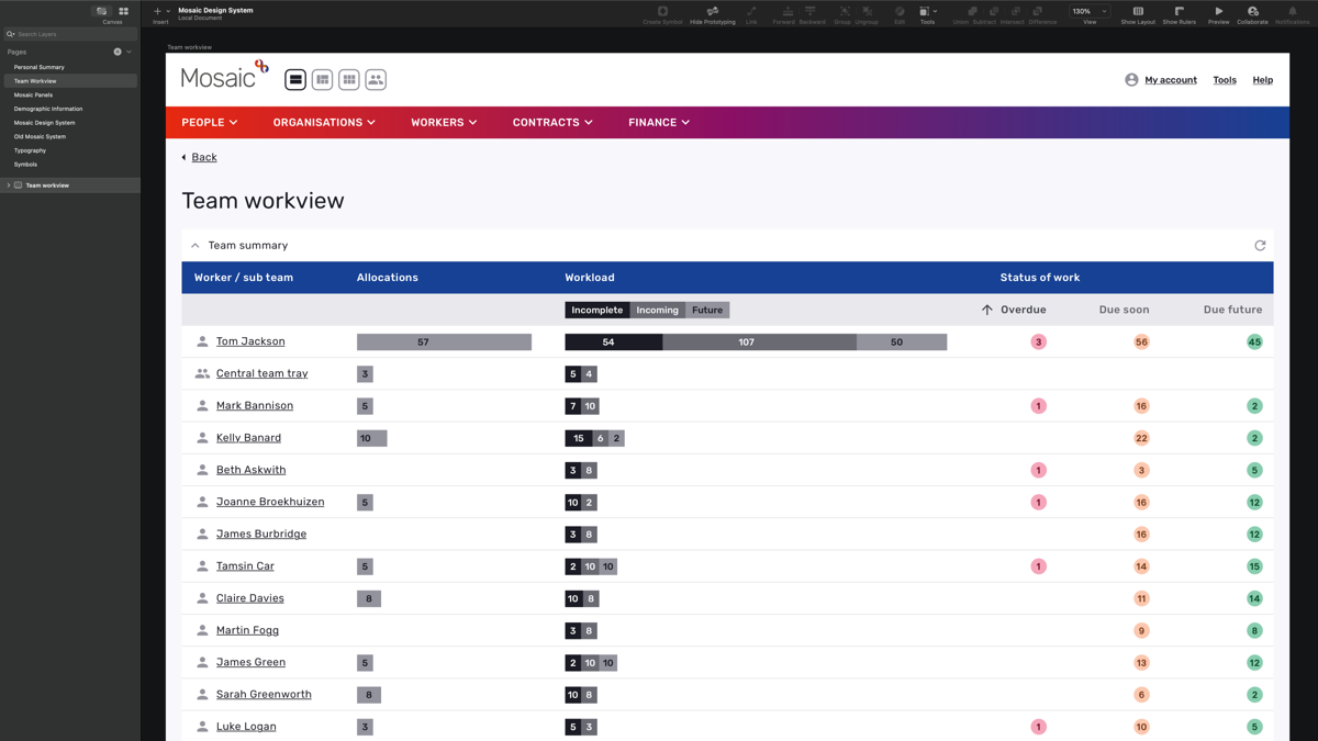
Information for end-users
A big part of the system was to present information using panels. These panels would include valuable information about a person or persons and other information relating to a case. There could be few or many depending on the scale of the case.
Defining the overall look
When the panel design work was complete, I started design work on the overall interface appearance for Mosaic. I made some reference to the design work Servelec had done with its online branding. It was important to maintain brand awareness and ensure some of the Servelec identity was part of the design for Mosaic.
This design work included elements like header, navigation, footer and other page contents. The result was a clean, minimalistic interface feel with a Servelec touch.
The results
I delivered an attractive new interface with an Improved User Experience where possible, within the time-frame. This work met the needs of the client and their end-users.
My involvement includes:
- UX/UI Design and Art Direction
- Research and Analysis (end-users)
- Design System and Style Guide
- Accessibility Standards
Share this project