A complete rebrand and design for Max Powder
- Client
- Max Powder
- Industry
- Automotive
- Year
- 2018 (updated 2020)
Overview
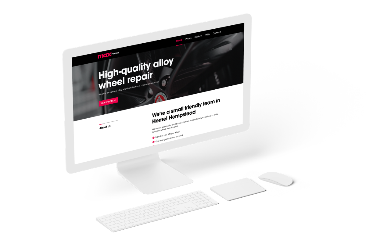
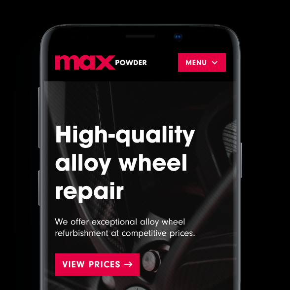
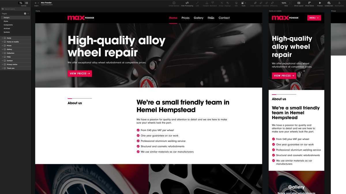
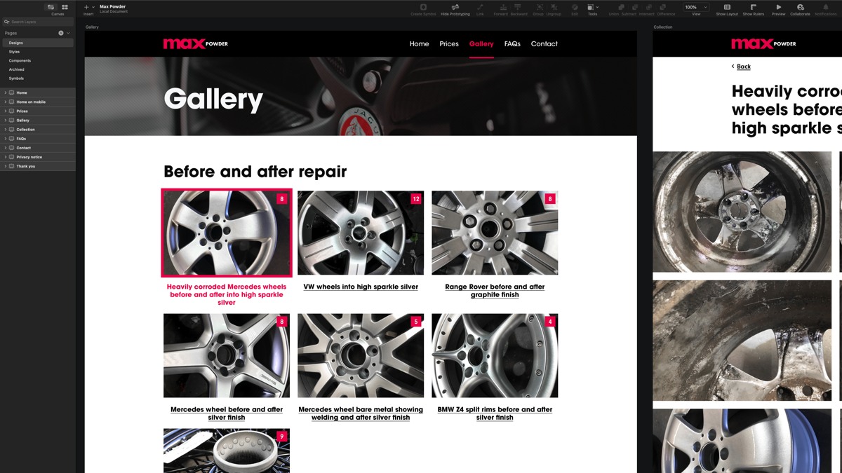
Max Powder wanted a complete rebrand with a more up-to-date look and feel. They wanted the website to work on all devices, small and large with the ability to manage their prices, photo galleries and other important information.
The rebrand and design had to convey the high-quality work Max Powder produce. The goal was to keep content to a bare minimum, with nice use of photography and emphasis on customer feedback from the work they do.
Brand identity
I started investigating various typefaces that I feel worked with the words ‘max’ and ‘powder’, with greater emphasis on ‘max’.
Avant Garde, one of my personal favourite typefaces, was the perfect candidate for the vision I had in mind. Inspired by the FedEx logo created by Lindon Leader, I manipulated the typeface to adopt a similar style which I feel worked very well.
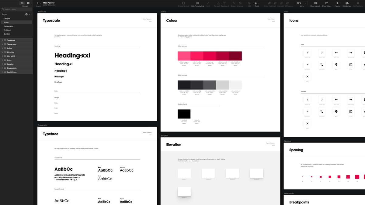
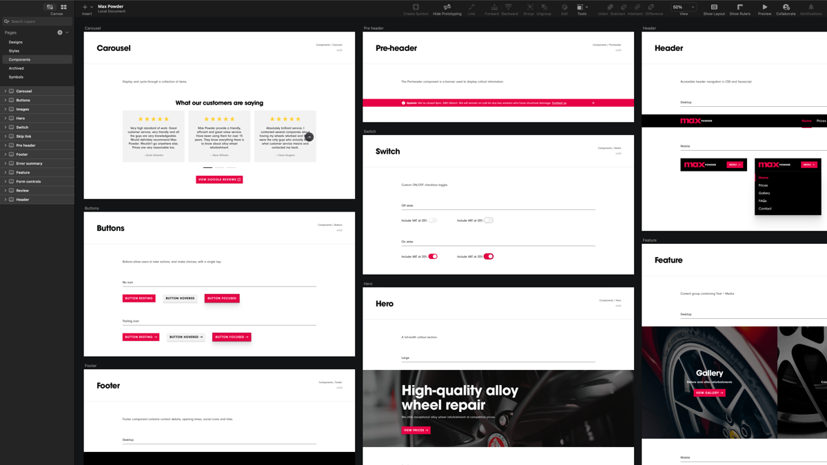
Style guide and visual design
An important process was the preparation of designed elements on pages. A carefully selected typeface and a responsive scale to maintain vertical rhythm.
The design system included carefully designed and prepared elements which incorporated everything from buttons, grid, colours, icons, form elements and more, to define the style and image for Max Powder.
Managing their content
ExpressionEngine was used as the content management system for Max Powder and was a perfect fit for this type of project. It’s flexible, secure and very powerful.
They have the ability to manage most of their site content, anything ranging from prices to photo galleries, which was exactly what they wanted.
Quality assurance
I ensure that the website is secure and running at its best. It is also fully accessible, search engine friendly, and up-to-date. I use Google Lighthouse as an automated testing tool to improve the quality of Max Powder.
The results
I delivered a complete brand identity including logo design to be used on various materials from signage, business cards and invoices. I also designed and built the website from scratch to fulfil the needs of the client.
My involvement includes:
- UX/UI Design and Interaction Design
- Logo Design and Brand Guidelines
- Web Development (HTML, SASS, JavaScript)
- ExpressionEngine Integration
- Google Cloud Platform
- Mobile Friendly Design
- Accessibility Standards
Share this project